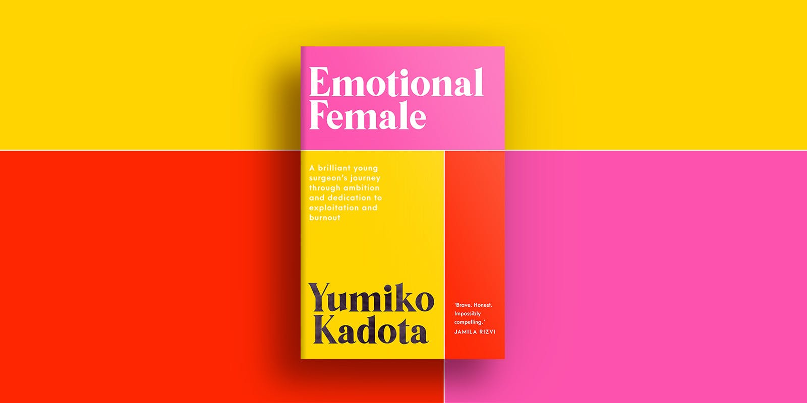
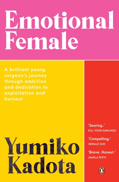
A behind-the-scenes look at the cover design process for Yumiko Kadota’s memoir.
Yumiko Kadota made headlines in 2019 when the story of her experiences as an overworked trainee in the health system were picked up by the media. Her original blog post opened with the words: ‘I never thought I would say this, but I broke. I give up. I am done. I am handing back my dream of becoming a surgeon.’
Yumiko’s subsequent memoir, Emotional Female, is a passionate account of the toxic culture of bullying and overwork that junior doctors can experience. Described as ‘[b]rave. Honest. [And] impossibly compelling’ by Jamila Rizvi, this book needed a strong cover that spoke to the themes of burnout, stress, and ultimately hope for the future. We sat down with Yumiko and senior designer Louisa Maggio to find out how they approached this mammoth task.
Yumiko:
The cover for Emotional Female was inspired by the Oxford Handbook of Clinical Medicine. In the UK, it’s affectionately called the ‘cheese and onion’ for the bold yellow and green blocks of colour. It’s a pocket-sized handbook owned by medical students and junior doctors around the world, and can often be seen carried around on the wards.
I own two of the handbooks – one for medicine and another for surgery. I have fond memories of reading them, absorbing little nuggets of information on bus rides to and from the university and public hospitals. I wanted to pay homage to one of the iconic textbooks that helped me through my studies. It’s also symbolic for what a career in medicine is like. There is a well-delineated pathway up the medical ladder, and doctors do everything ‘by the book’.
When I was faced with the decision to leave the profession, I felt like there was a no longer a manual I could follow. Now I’ve written my own story, and hope that some of my words might become a page in someone else’s survival guide.
Louisa:
I worked closely with Publisher Nikki Christer, bouncing ideas and sharing conceptual illustrations with her for Emotional Female. All of the early designs centered around an illustration of Yumiko or featured her in some symbolic way.
The final design is a tribute to the Oxford Medical Handbook. Colour plays an integral role, and the selection of striking colours: red, pink and yellow represents bold femininity. While the cover is a nod to the medical bible that students follow, it is also designed to be a deliberate and symbolic representation of Yumiko and her story, and absence of medical paraphernalia is also very deliberate.
When working on such a simplistically styled design, the relationship between the elements and typography is paramount. And so, I wanted the typography to also be a clear visual link to the 1970s feminist movement, and I wanted this design to command attention through this style of typography.
In the end I feel like we have a design that not only imbues symbolism that is representative of Yumiko, and is symbolic of her story, it is a deliberate nod to her self-discipline and dedication, all while paying homage to medicine and strong women.
I love that we have created something that represents a vital book in any medical professional’s career, with a cover that will instantly draw those with this knowledge, to it. It’s somewhat of a blank canvas, without being very blank at all. Open for interpretation to anyone.


