We talked to some of our graphic designers to learn more about the amazing book covers they created this year. Find out what runs through the mind of a designer as they bring a book to life through design.
We all know the saying, ‘don’t judge a book by its cover’, but sometimes you can’t help it! When a beautiful book cover is staring right at you, it’s simply impossible to not reach for it.
Seeing a gorgeous cover invites readers to select a book, and this year there were plenty of enticing covers to choose from. Whether you like maximalist patterns or bold block colours, books this year were fabulously designed to reflect the wonderfully written material between the pages.
To learn a bit more about what it takes to make an eye-catching book cover, we touched base with some of our graphic designers from all around the world. Having designed some of the most amazing covers this year, it’s safe to say they know their stuff.
Read on for a peek inside a designer’s mind to learn more.
Most beautiful book covers of 2022
Idol by Louise O’Neill
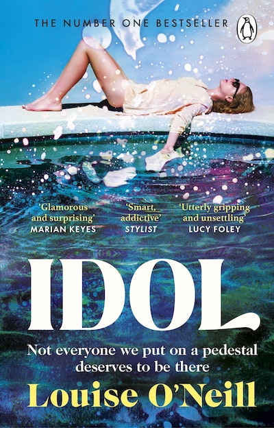
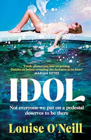
Idol is a thought-provoking novel that explores many relevant topics, from how we idolise social media influencers to wellness culture, female friendship, consent and how trauma plays a part in how we remember past experiences. Design-wise we needed that contrast between a glamorous life confronted with the many dark secrets that slowly get revealed throughout the book.
Visually, it was important to create a sense of the main character being on top of a pedestal, almost untouchable, for that reason I also left the type at the bottom below her. I wanted to create a contrast between the dazzling, almost dreamlike summery blue sky at the top, and the dark and alluring swimming pool at the bottom. It represents how that ‘picture-perfect’ photo, which can be captured in a second and posted on social media doesn’t always tell the whole story…
– Irene Martinez
Lessons in Chemistry by Bonnie Garmus
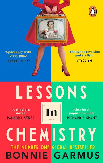
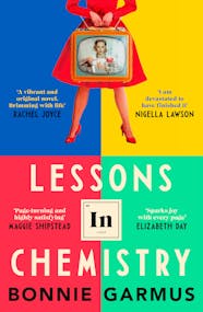
This multi-faceted novel could have taken on many forms in terms of its look, as there is so much to unpack and equally so much that resonated with me. However, I decided to break it up into three equal parts.
- To get across the sense of Elizabeth Zott's extraordinary and unapologetic character, since she is at the heart of what people have adored so much about this fantastic novel. When shooting the cover, it was important that her stance was almost confrontational and not particularly dainty or ‘ladylike’ - as so many men in the novel try to force her to be.
- Then I wanted to allude to the scientific themes, but not overly so since the word ‘chemistry’ is already in the title. In the end, I felt this was most effectively and subtly achieved using the periodic symbol of ‘In’ which is, happily, already an element (indium).
- The Supper at Six TV Show, where Elizabeth is a cookery TV host.
I was also heavily inspired by vintage magazines aimed at the ‘perfect housewife’ and the advertisements for kitchen tools and white goods. Usually, these featured a woman smiling gleefully, whilst producing food for her expectant husband.
I wanted to flip this narrative on its head and use this sort of grainy photo treatment in a semi-ironic way, which in turn helped give the cover a sort of retro feel. In terms of staying true to the period feel, we sourced our character outfits from a costume hire warehouse that specialises in clothing throughout the eras!
The quadrant background design stemmed from looking at images of TV interference and noticing the graphic blocks of colour. It provided a memorable and eye-catching backdrop. It also gave the cover a modern edge against the 1960s photograph.
– Beci Kelly

Ottolenghi Test Kitchen: Extra Good Things by Yotam Ottolenghi and Noor Murad
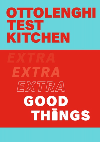
Ottolenghi Test Kitchen: Extra Good Things is the second in the fledgling Ottolenghi Test Kitchen series. The intention was to create a strong, bold series style while still allowing each title to stand alone and relay its individuality, independently of other titles in the series.
The colours are intentionally bright and perhaps atypical of cookbook palettes. Each book has its own recognisable lead colour which is also used on marketing materials and communications. There is also a colour-related link back to the previous title, creating cohesion between the titles in the set.
Something is pleasing about a series of books that line up along a bookshelf while each one retains its individual associations.
I wanted to make sure that the book would be eye-catching wherever you might encounter it, whether in a bookstore or online. Adding the gloss-varnished ‘extra, extra’ words provided a little extra (see what I did there) surprise along with the tactile matte finish and flexible binding. The small addition of the jar icon used in place of the letter ‘i’ in the word ‘things’ is another nod to the idea of plentiful good things.
– Caz Hildebrand
Shrines of Gaiety by Kate Atkinson
Shrines of Gaiety is, at the time of writing this, Kate Atkinson’s newest book, adding to her long list of captivating novels.
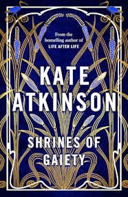
My art director, Richard Ogle, created her well-known brand and look, but when the manuscript arrived the editor realised that this story was something completely different from what she had written before.
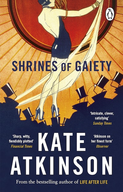
The team wanted to keep her current branding with the type Richard had created so that her audience would immediately recognise her when seeing the title and name, but change the cover style a bit so that they would know that it was not going to be a normal 'Kate book' but something else entirely. The vision was a cover that was intricate, lush and vibrant to reflect the roaring twenties.
I captured this vision by creating an Art Nouveau border and picking deep rich blues. I also tried to tie in elements from the era. I nodded at the Egyptomania of the 1920s by using an iris and bulrush pattern that I found on an authentic 1920s wallpaper. I gold-foiled the majority of the cover (or as much as the team would let me) to best reflect the opulent setting of this book. One of the most fun parts of designing the jacket was placing cheeky ibises on the flaps holding some of the type to showcase the eccentricities and liveliness within the story.
– Marianne Issa El-Khoury
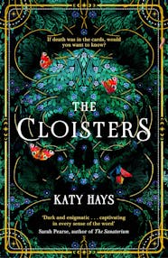
The Cloisters by Katy Hays
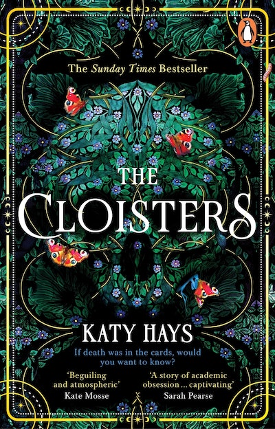
The Cloisters is Katy Hays’ début novel, which is primarily set in the Cloisters Met. The Cloisters Met is the second branch of The Metropolitan Museum of Art – a stone cloister built atop a hill in Central Park that houses art and artifacts from medieval Europe.
Within the conclaves of the building is a lush garden full of medieval plants, some with healing properties, some deadly. This garden was the biggest inspiration and the main concept I wanted to represent with this cover. I wanted the audience to have an inconspicuous feeling of dread and death, unnoticed at first sight, lurking in the background.
I tried to achieve this by filling the entire cover with lush flora and manipulating the movement and shapes to create a hidden skull.
I also wanted to juxtapose this idea of hidden dread by having several peaceful-appearing butterflies sitting on the floral skull, but when you look closer you see one of the butterflies being devoured by a hidden praying mantis.
The story centres around a set of 15th-century Italian tarot cards, and the team wanted that reflected in the cover. I did this by hiding cosmological patterns within the border, which reflects the shape of an actual card with its rounded edges.
I tried making the skull as hypnotising as possible by gold foiling thin and short circular lines around the design. This complemented the border and also emphasised the shape of the skull to lure you in.
– Marianne Issa El-Khoury
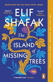
The Island of Missing Trees by Elif Shafak
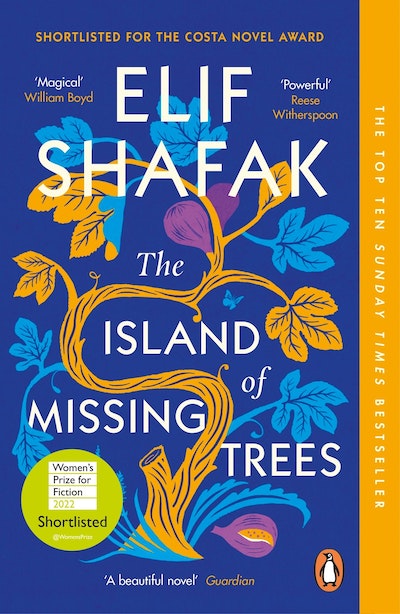
The brief was to create an illustrative cover that evoked the Mediterranean setting with a focus on nature and especially the fig tree that narrates the story.
After looking at a few different ideas, the final tree began to take shape. Originally the design was fuller, with birds and insects. But in the end, we stripped a lot of the details back to just make the fig tree the star of the cover.
It occupies the whole space with twisting branches and type woven through. On closer inspection there are some narrative clues, such as the two figs representing the parents, the fallen fig as the daughter and her inherited trauma and loss of identity and the broken branch where Kostas and Defne took a cutting.
– Julia Connolly
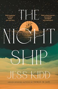
The Night Ship by Jess Kidd
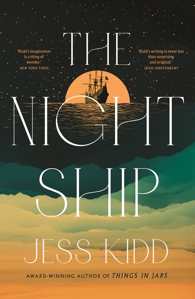
Penguin Random House UK had already designed a cover but the thoughts were that it wasn't right for our Australian market. The novel is set over two different periods, centuries apart, so making the cover look historical but also contemporary was a real challenge.
The publisher was after something illustrative, but I am not an illustrator, so that was an extra challenge on top.
In the end, the cover consists of several images (about four or five), photoshopped together to create the final version.
. . . and here is a little secret, the 'sea' that fills the bottom of the cover is actually an image of a mountain range with the colour inversed to get the effect. In the end, the Australia cover was actually used by the UK and US publishers too!
– Adam Laszczuk
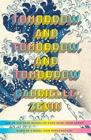
Tomorrow and Tomorrow, and Tomorrow by Gabrielle Zevin
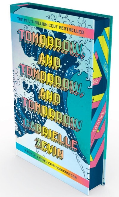
Although this book takes place in the world of video game design, it is really, like most great books, the story of characters and relationships. The first challenge was to not be overt about the video game angle, yet I still wanted to retain the colour and energy of that world.
The second challenge was self-imposed. Hokusai’s Great Wave painting. I did not want to go there. It has been reproduced ad nauseam, on posters, calendars, mugs, rugs, shower curtains, and likely other book covers. But since it was such an inspirational plot point, I had to give it a try. Miraculously, the incongruity of combining the splash-screen-inspired type with the centuries-old painting created something fresh and exciting that practically leaps off of the bookshelf.
– John Gall
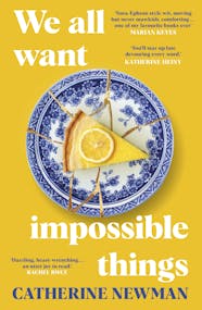
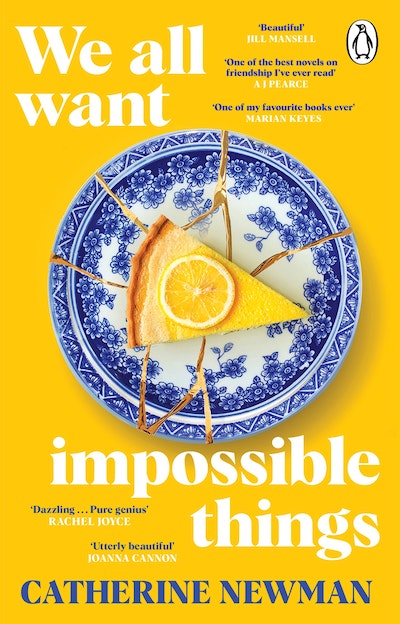
We All Want Impossible Things by Catherine Newman
This is a novel that breaks your heart, yet manages to put it back together piece by piece through its humour, love and everlasting friendship.
I thought this was best summed up visually through the idea of a shattered plate, restored by using the Japanese art form of Kintsugi, meaning 'joining with gold'. The art of Kintsugi is a celebration of those imperfections and the history of those broken parts. Ultimately, it symbolises the philosophy of embracing the beauty of human flaws and a life well lived, through good times and bad.
Sat atop this plate is Edi’s memory of the most perfect lemon polenta cake from her past, which throughout the novel she is in the pursuit of tasting just once more…
The staggered type, ranged both right then left, is in response to the poetic nature of the title, and the words within.
– Beci Kelly
Want more behind-the-scenes action? Take a look at these photos of our authors on the road!


